How to: friction logs
Most software is bad. I neither know why, nor how to solve the problem. Instead, the best I have to offer is a technique to keep the badness away for a while: friction logs.
Friction logs are what they sound: a detailed log of everything that caused friction when using a product. This post teaches you how to make one. I recommend you to make one if:
- You are working on a software product
- You are very curious about a company and their product
- You are trying to get better at product management and design
Here are a couple of the friction logs that I made this past year for products I was curious about:
You can find a lot more here. They are only interesting to the team that is working on the product. I only link them so that you have examples to base yours from.
How to
1. Setup
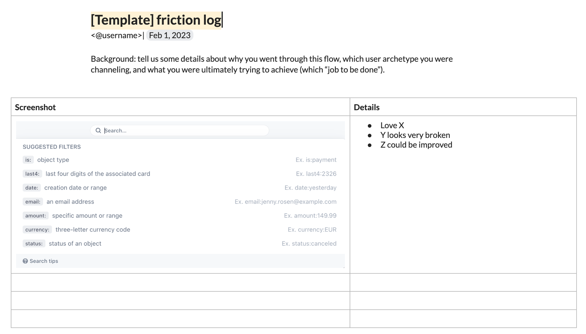
Open a new document. You can structure this however you like. I usually write what I find and take screenshots of it as I go along. Alternatively, here is Mike Fix’s more structured template with a two column table with screenshot on the left and notes on the right:

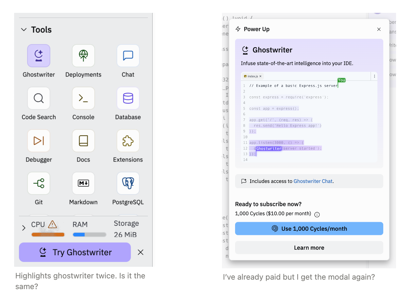
I use Notion or Dropbox Paper because they simplify text formatting and make it easy to lay out several images in columns. I take a ton of screenshots and it is convenient to lay them out in grids and add captions. Here are two screenshots from the repl.it friction log with captions:

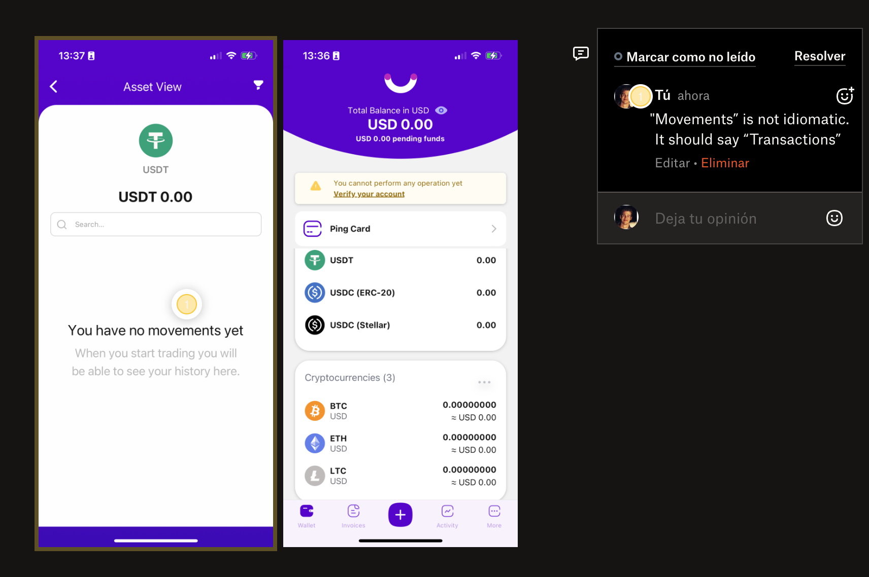
Paper has the additional feature where you can attach a comment to a specific point of the image (yellow circle over "movements"):

Do minimal research. You should know enough about the product to know who and what it is used for (e.g. for Stripe "online businesses accept payments"). But ideally, not much more. You want to approach the product with a beginner's mind.
Role play. This is the most important step. Pretend to be a concrete type of user (with a concrete use-case in mind before you get started:
- Who are you?
- "I am a founder and developer for a new mobile chat app"
- What you are trying to do?
- "I want to charge $5 monthly subscriptions to each user a month after they signed up for my existing app"
- What do you know?
- "I am an experienced programmer but I have never used Stripe before"
- What are your deal breakers?
- "I am an iOS fanatic and everything about paying needs to be handled by native components → no redirects."
It is important to consider all of this upfront. Otherwise, when you hit blockers, you might be inclined to change your requirements and not recognized the product failed.
From the repl.it friction log:

Make sure they want feedback. Doing a friction log will take you a few hours. Make sure the responsible team wants to do something about it.
2. Use the product to actually accomplish the goal
Check how the product is distributed. Arrive to the product the way the user would. If you think you'd google "charge subscriptions stripe" do that. If users start from an email, do that.
If instead, you start using the product from the ideal place (because you know where it is), you will miss half of the friction: searching for what you want. In Stripe's case, this is finding the right guide in the documentation out of many, many guides.
Nothing is too small to be noted. Friction logs are not about grand problems or philosophical discussions. They are about concrete details that cause friction. There was a typo. The site uses a font with similar "u" and "y" letters, which makes it hard to read the word "Buy" (Instacart). Every interaction feels slow. The spacing between two elements makes it hard to tell if they are connected or not. Too little contrast.
Here is a tiny observation from the Notion AI with Q&A friction log:
When you hover over a footnote number, where the source was hidden, it doesn’t reveal the source. This is fine but I expected to see the source.
This level of detail makes them dull to read for anybody except the team responsible for the product.
Take screenshots of everything. Whenever you find something wrong the screen, take a screenshot and note what the problem was. Some people only take screenshots as they see things and only fill in the words after when they understand what the problem was.
Notice what you feel. We are socialized to keep calm and collected at the workplace. This makes it hard to notice how annoyed or angry you'd be when using your own product.
This TikTok video perfectly captures the type of inner dialogue and self-awareness you need. The narrator has perfect awareness of his emotions. As the video progresses, agreeing with everything he says, but I also don't think I would've been capable of verbalizing it the way he did.
As I go, I usually mark the intensity of what I felt with color emojis (green, yellow, red) to prioritize later. From the Perplexity friction log:

Solve problems the way a user would. If you get an impossible error that only the product owner would understand, pretend you don't and try to predict what the user would do. Where would they go to fix it? Do they have a clear way of doing so?
Notice when you would've given up as a customer. Say so in the friction log. Note what was the blocker. This is like when your videogame character dies and you need to restart from a checkpoint. Even if there was an easy solution if they only knew what they were doing, each one of these blockers indicates complete defeat: your product lost the game.
Only after you've admitted defeat, resolve the problem using your knowledge of the product to keep going.
From the Zapier friction log:

3. Reflect upon the experience and summarize
Extract common problems or themes. A common problem when using APIs like Stripe is that certain concepts never become clear (important friction). For other concepts, you may start a little confused but quickly find your footing (small friction). This is why I wait until the end to make broad points.
Rank the top 3 problems to solve. You will encounter so many problems that it will be hard to know which ones to tackle first. Start by ranking the most important 3 problems. Otherwise, it is likely that the responsible team will be overwhelmed by the implied amount of work.
From the ChatGPT friction log, I found onboarding to have the most problems:

Decide if the product actually solves the problem. Depending on how it went, the product may have completely failed to solve the problem despite mostly working. If you found at least one deal breaker, that is that. No matter how good the rest of the product is, it doesn't work for that use-case. I find this important because we, the people that work on software products, often perceive "an average" experience: most of our interactions are good, therefore the product is good. False. One blocker is enough to make the product useless.
From the Bing AI friction log:

4. Send to the responsible team
You don't expect all the problems to be solved. Make this clear when you send the friction log.
Many problems are the results of trade-offs and that there is no clear Pareto improvement. Make this clear when you send the friction log.
Your feedback is about the product, not them. This is common advice when giving feedback ("talk about the work, not the person") but it is worth repeating.
Be around for questions. They will certainly need additional context to reproduce certain context. They will also have questions to understand your what you were thinking when you made certain decisions.
Thank you to Michelle Bu and Tara Seshan for endless discussions on product quality. Thank you to Jeff Weinstein for giving feedback on the article and doing a lot of friction logs! Thank you to Mike Fix for the friction log template and tons of product quality work.
If you want help with product quality or friction logs at your company, email me at sbensu@gmail.com and I'll see if I can take a look.