We need visual programming. No, not like that.
Summary
Most visual programming environments fail to get any usage. Why? They try to replace code syntax and business logic but developers never try to visualize that. Instead, developers visualize state transitions, memory layouts, or network requests.
In my opinion, those working on visual programming would be more likely to succeed if they started with aspects of software that developers already visualize.
Context
Every few months somebody puts out a very nice visual programming language that looks something like this:
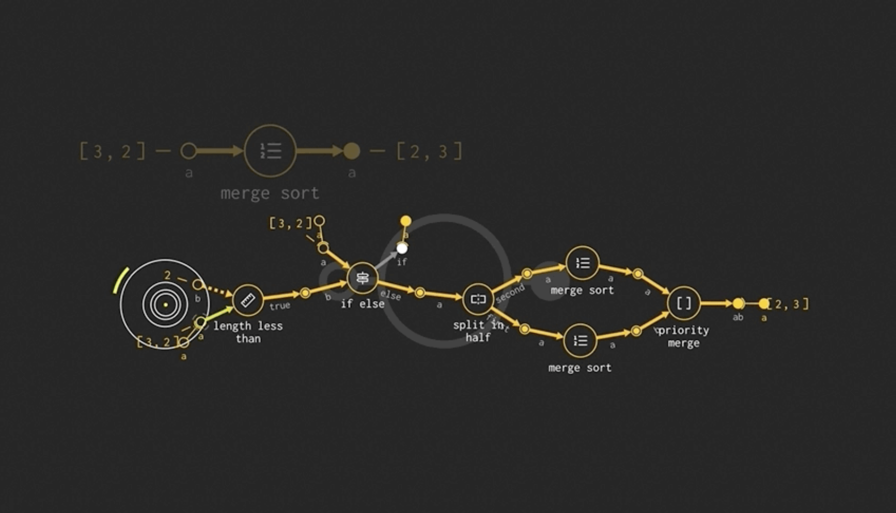 This one looks particularly sleek, most of them are much less inviting.
The algorithm above is replacing some pseudo-code that looks like1:
def merge_sort(a):
  if (length(a) == 2):
    if (a[0] < a[1])
      return a
    else
      return [a[1], a[0]]
  else:
    [x1, x2]  = split_in_half(a)
    sorted_x1 = merge_sort(x1)
    sorted_x2 = merge_sort(x2)
    return priority_merge(sorted_x1, sorted_x2)
Like the example above, the systems I am referring to are trying to replace the code syntax itself.
But every time one of these visual programming systems come out, we think "oh neat!" and never try them. I have never seen any of these visual programming systems even be mentioned while trying to solve problems. Why? Why do we keep circling back to visual programming if nobody ever uses it?
One reason is because we think that other, more inexperienced, programmers might have an easier time with visual programming. If only code wasn't as scary! If only it was visual! Excel Formula is the most popular programming language by a few orders of magnitude and it can look like this:
=INDEX(A1:A4,SMALL(IF(Active[A1:A4]=E$1,ROW(A1:A4)-1),ROW(1:1)),2)
I'll ignore this reason because many of these tools explicitly meant for experienced developers. They assume that you will install them with npm install or deploy its code to AWS Lambdas.
Why does visual programming fail for developers?
Developers say they want "visual programming", which makes you think "oh, let's replace if and for". But nobody ever made a flow chart to read for (i in 0..10) if even?(i) print(i). Developers familiar with code already like and understand textual representations to read and write business logic2.
Let's observe what developers do, not what they say.
Developers do spend the time to visualize aspects of their code but rarely the logic itself. They visualize other aspects of their software that are important, implicit, and hard to understand.
Here are some visualizations that I encounter often in serious contexts of use:
- Various ways to visualize the codebase overall.
- Diagrams that show how computers are connected in a network
- Diagrams that show how data is laid out in memory
- Transition diagrams for state machines.
- Swimlane diagrams for request / response protocols.
This is the visual programming developers are asking for. Developers need help with those problems and they resort to visuals to tackle them.
If you are skeptical about needing these, let me ask you: do you know exactly how your data is laid out in memory? Bad memory layouts are one of the biggest contributors to poor performance. Yet it is very hard to "see" how a given piece of data is laid out and contrast it with the access patterns present in the codebase.
Alternatively, do you know all the external dependencies your code hits when responding to a given HTTP request? Are you sure? Didn't you notice that Bob just added a call to a rate limiter service in the middleware? Don't worry, you'll learn about it in the next outage.
For both of these questions, the answer is usually "I think I know the answer?" with a creeping fear that maybe you missed something you couldn't see.
Sadly most of those visualizations are:
- made ad-hoc by somebody that goes out of their way to do it
- manually made, on a napkin or Whimsical
- rarely integrated to a standard workflow
This is not to say that the industry has nothing to show for. Some visualization techniques are integrated into developer environments and heavily used:
- The DOM element inspector view
- Flamegraphs in profilers
- SQL tables diagrams
But these are the exceptions not the default. Isn't it great when you can pinpoint the performance problem in a flamegraph? We need that for everything else.
I'll now cover some of those visualizations to prime you to consider them for your current work or even integrating them into existing developer environments.
Codebase visualization
This great talk shows many ways to visualize different aspects of a codebase. There are a lot! Here are some that interest me:- Treemap: statistical overview of files in a codebase
- Sourcetrail: a class hierarchy and dependency browser
- Code retention over time
Sourcetrail
Sourcetrail is an open source to visualize codebases (no longer active), written by the speaker in the talk above. Here is a great overview of how the tool helps you navigate a codebase. It looks like this:
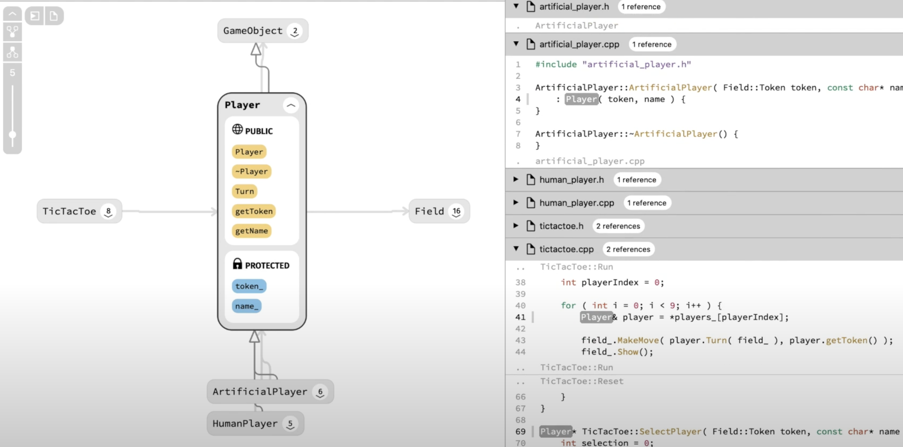
Sourcetrail solves many of the common design problems of code visualization:
- It shows the visualization next to the code. When you over on the code, it highlights its visual representation. When you hover on the diagram, it highlights the code. When you click on a dependency, it takes you to the code responsible for that dependency (e.g. one function calling another, one module requiring another).
- It is smart about hiding information. In codebases, there are often too many connections to visualize at any given time without overwhelming the user. Sourcetrail tool shows you what it thinks you are looking for first, and asks you to click / hover for more. The UI is designed to to pull on threads that seem interesting, not to get an bird's eye view of the codebase. This is the opposite from Treemap (covered below), which is explicitly designed to get an overview
But, as the demo shows, it suffers from some of the common problems of this type of visualization:
- There are no obvious hooks to "when do I need this". When you are profiling, you think "I need a flamegraph". When do you need this visualization?
- It is not in the same tools that I want to use. The demo shows the user switching between Sourcetrail and Sublime. That type of code visualization and navigation wants to live inside of the code editor.
Treemap
In this set of videos, Jonathan Blow implements a "treemap" to inspect different aspects of a codebase. From watching the videos (I've never used his viewer), the last version looks like this:
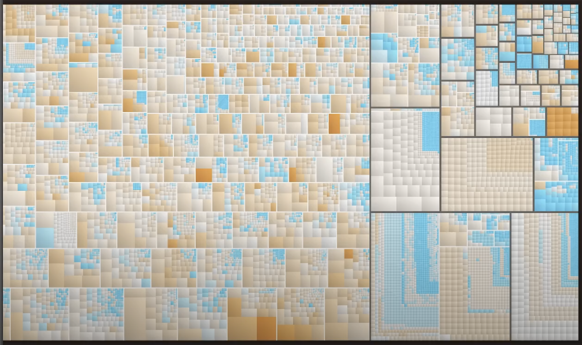
- Each square represents a code file
- The size of each square represents the size of the file
- The color of the square represents a blended of complexity metrics in each file like depth of nested ifs, depth of nested loops, number of global reads, etc.
With this type of visualization you can visualize other (size, color) metrics over the codebase, like (code_size, code_quality), (code_size, heap_access / code_size), etc.
Even if you visualize something as simple as just code_size with no color, that can be very useful when onboarding in massive codebases. A typical Big Tech monolith might look something like:
packages/
  first_dependency/
    first_transitive_dep/
  second_dependency/
    second_transitive_dep/
  ...
src/
  bingo/
  papaya/
  lmnop/
  racoon/
  wingman/
  galactus/
  ...
You probably glanced over it, didn't you? I glanced over it to when I joined a large company. When you git clone this repository and navigate around it, you don't really learn what is there, not even the basic picture. In the example above, it turns out that most of the code is in the racoon/ service (3M LOC) and the second_transitive_dep/ (1M LOC). Everything else has less than 300k LOC and is, by comparison, a rounding error. You can work on this codebase for years without learning these basic facts.
Code retention diagram
Rich Hickey's History of Clojure paper has some neat visualizations to understand how the Clojure codebase evolved over time. This is a burndown chart generated from the Hercules CLI:
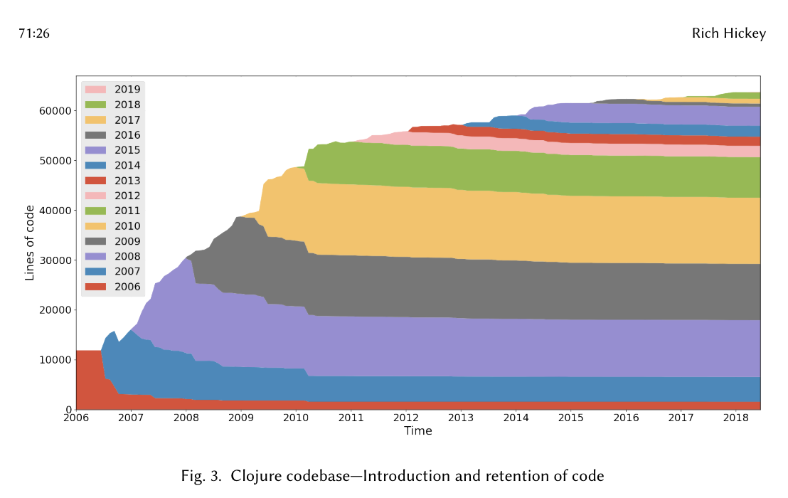
- The code that was written each year is represented as an area of a certain color (e.g. red for 2006)
- As some of that code is removed / replaced the next year, its area diminishes
- By tracking the colors, we can see the staying power of the code written each year. For example, the code written in 2006 (red) was largely removed or replaced. But the code written is 2011 (green) has stayed almost untouched since then. This is true for most years!3
Computer networks and service topologies
If you ever use AWS, you'll see that its documentation is full of diagrams like this one:
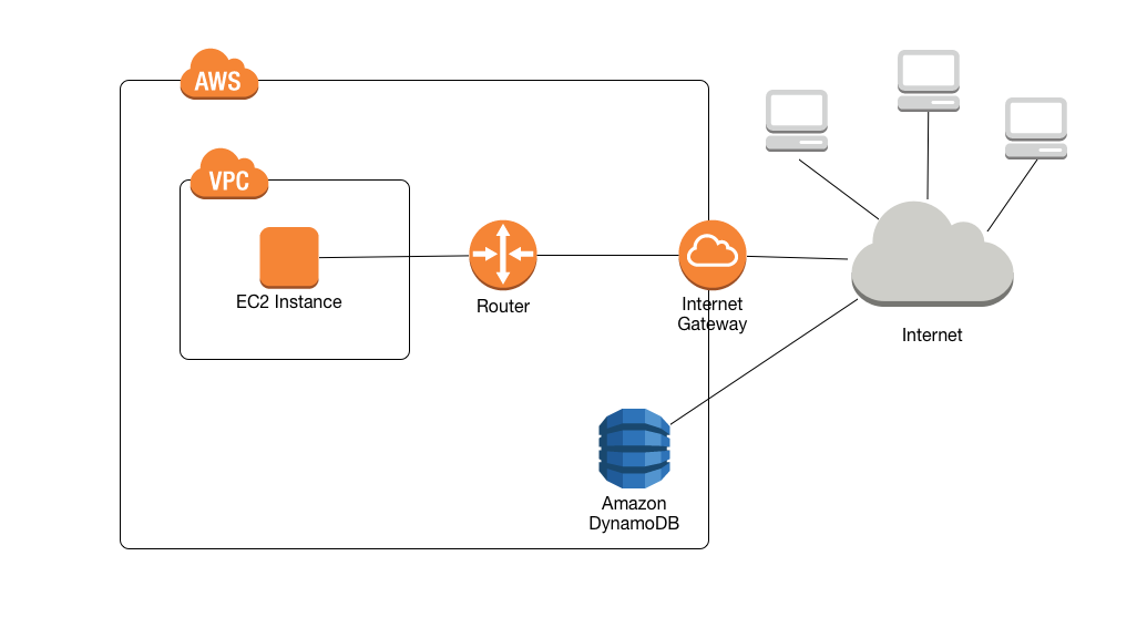
I think the diagram is very clear. It shows you all the "services" involved and their connections. In this case, if you know what each of them does, it is obvious how they relate to each other. (If you don't you have to go read about each one.)
Throughout my career, I made one of these topology diagrams for every single team I've belonged to. A few lessons from making them:
- As new people joined, I started from the last diagram I had made (6 months or so on average) which made it easier. There was also some change from last time.
- I missed something important each time I made the diagram.
- As far as I can tell, it was the most important technical artifact I ever transmitted to new people in the team.
Memory layouts
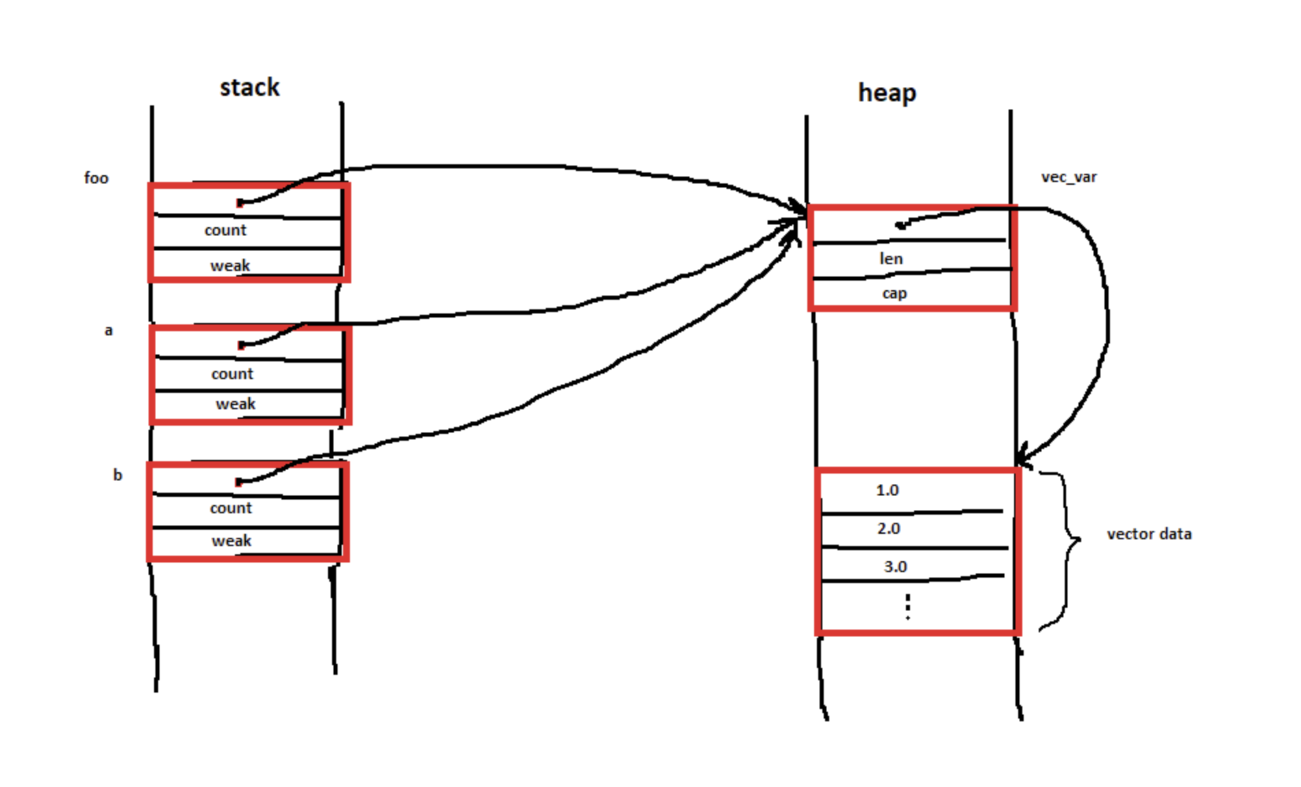
This reddit thread captures someone trying to understand the memory layout ofRc<T> pointers: Hello, I would like to understand the memory layout while executing the following piece of code, taken from the standard library example:
use std::rc::Rc;

let vec_var = vec![1.0, 2.0, 3.0];
let foo = Rc::new(vec_var);
let a = Rc::clone(&foo);
let b = Rc::clone(&foo);
I have imagined the memory layout like the following drawing. Is that correct? Thank you!
To which a different user replies with this other diagram:
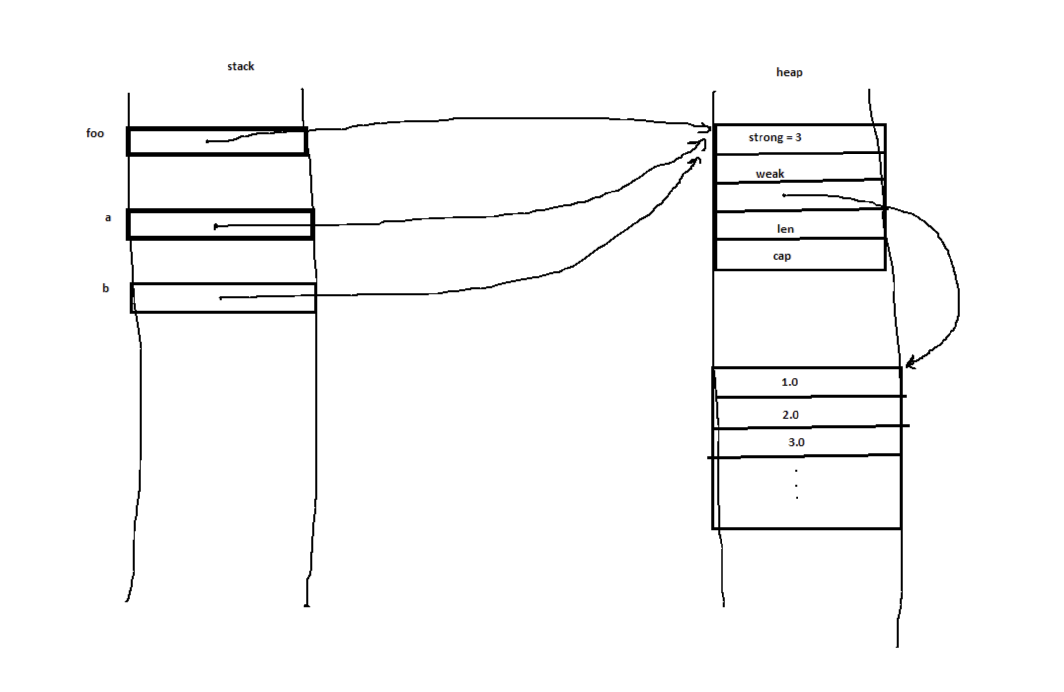
Notice that the original code hasn't changed. The only information transmitted in the answer is the corrected diagram. That is because to the person asking the question, the diagram is a better representation of their mental model. As such, getting an corrected diagram has an effect on their mental model but looking at the code doesn't.
The exchange concludes with (emphasis mine):
Hello and thanks a lot for your help, you've really thrown light on it.
This is why visual programming matters: it often matches what people are visualizing in their head (or failing to). Generating a good diagram lights up their head.
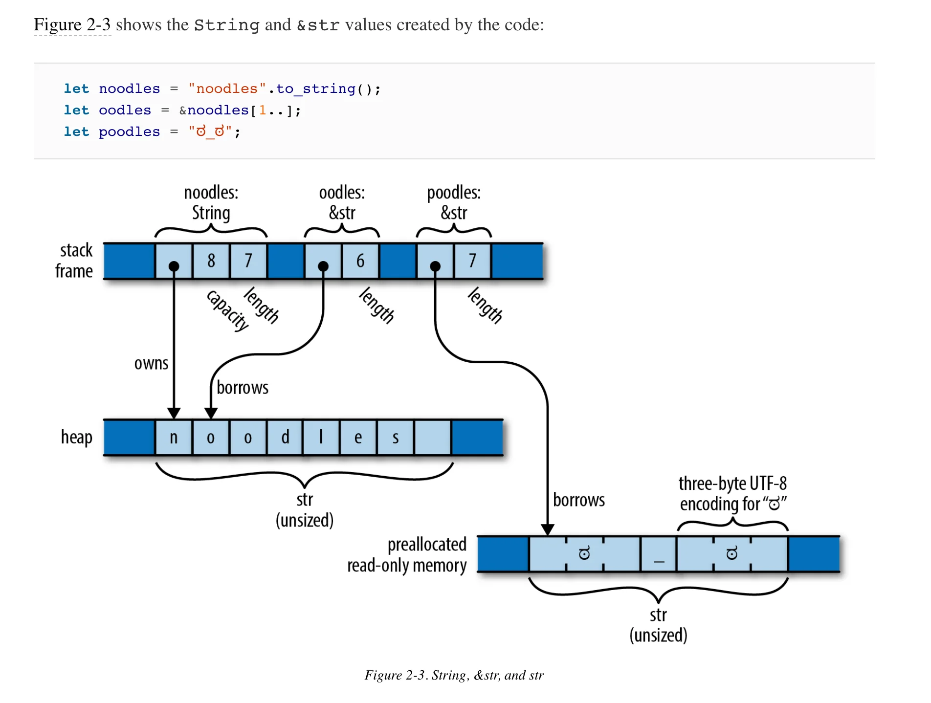
Programming Rust makes great use of memory layout diagrams:
Idea: Can you generate these diagrams directly from the struct type annotations?
Rust has another way in which "memory is laid out": its ownership model. No matter the shape of the size of the data in memory, different references "own" other references forming a tree. Ownership is better explained by this diagram from Programming Rust than by anything I could ever say:
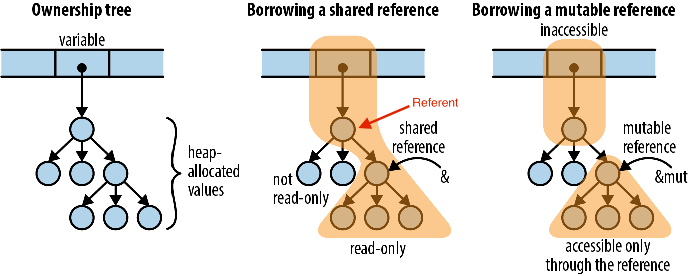
Idea: can you generate ownership trees given Rust source code?
State machines
These are pretty standard. The Idris documentation uses one well here to show what they'll be talking about before they introduce a bunch of novel concepts on how to model state machines in the type system. IMO, this example succeeds at two levels:
- If you have any familiarity with state transition diagrams, it takes a second to understand what is going on
- You are most likely not familiar with the code notation for the state machine, so it really helps to have an alternative representation for it.
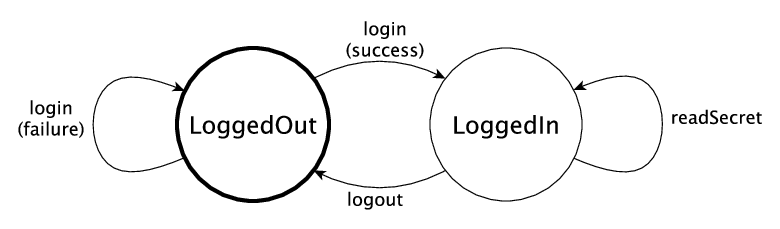
Idea: Can you generate these diagrams directly from the Idris type annotations?
But you don't need to stick to strict UML state machine diagrams. What are the states used for?
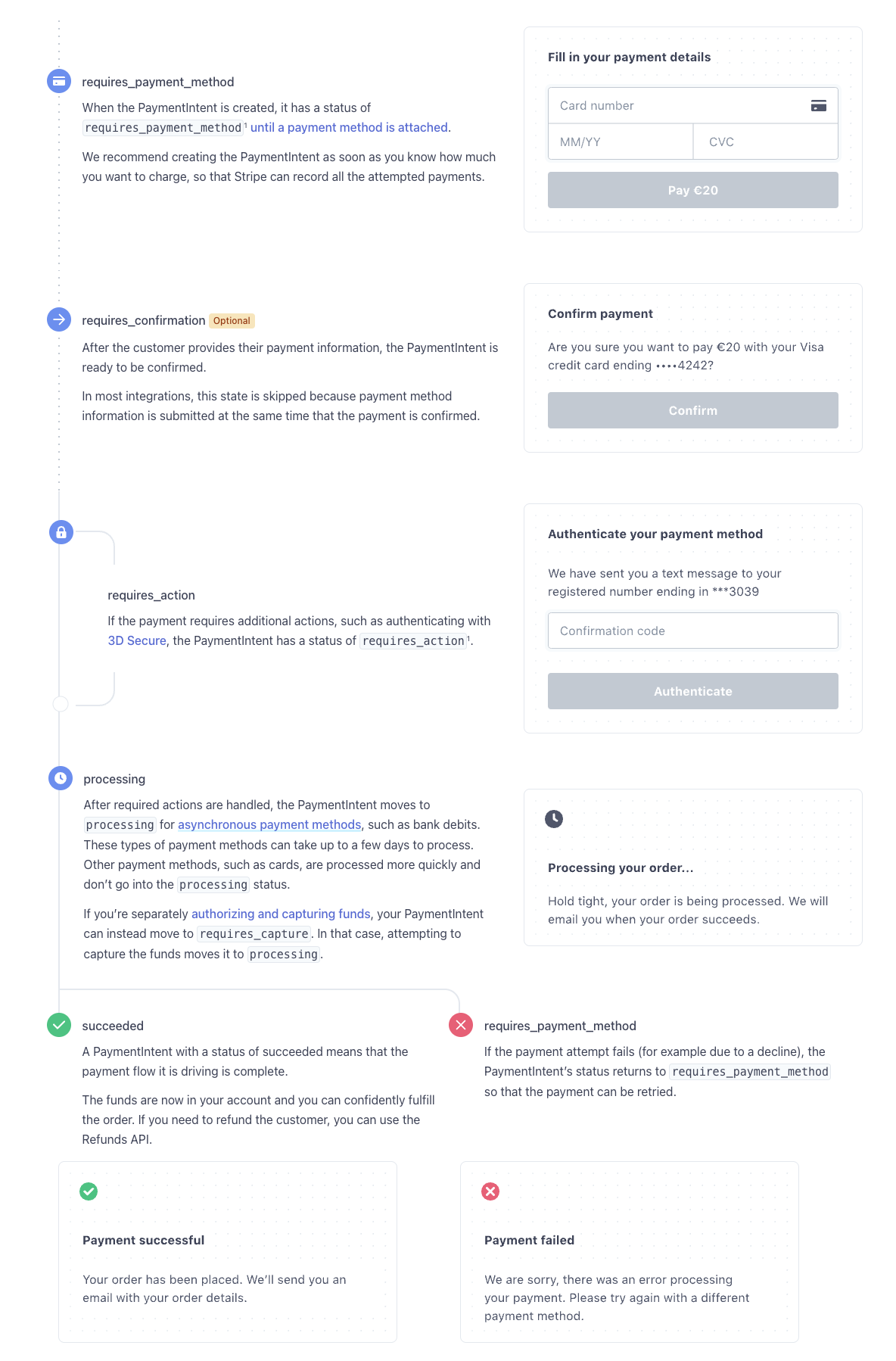
Payment Intents are the main object Stripe uses to represent an ongoing payment. A lot can happen to a payment, so it ends up having a pretty complicated state machine. We made this state machine diagram for it in 2019 with Michelle Bu and Isabel Bensusan. At the time, it was one of the first "diagrams" in the documentation.
The diagram walks through the different states a PaymentIntent can be in, with the corresponding UI for each:
For a fun example of state machines and how to formalize them, watch Leslie Lamport's lecture on transaction commit in TLA+.
Swimlane diagrams for request / response
Client / server request architectures can get pretty complicated. I've often seen people make swimlane diagrams to track them.
Here is a good example in the Stripe documentation. It shows all the request / responses that happen when a customer checks out, saves their payment method, and pays:
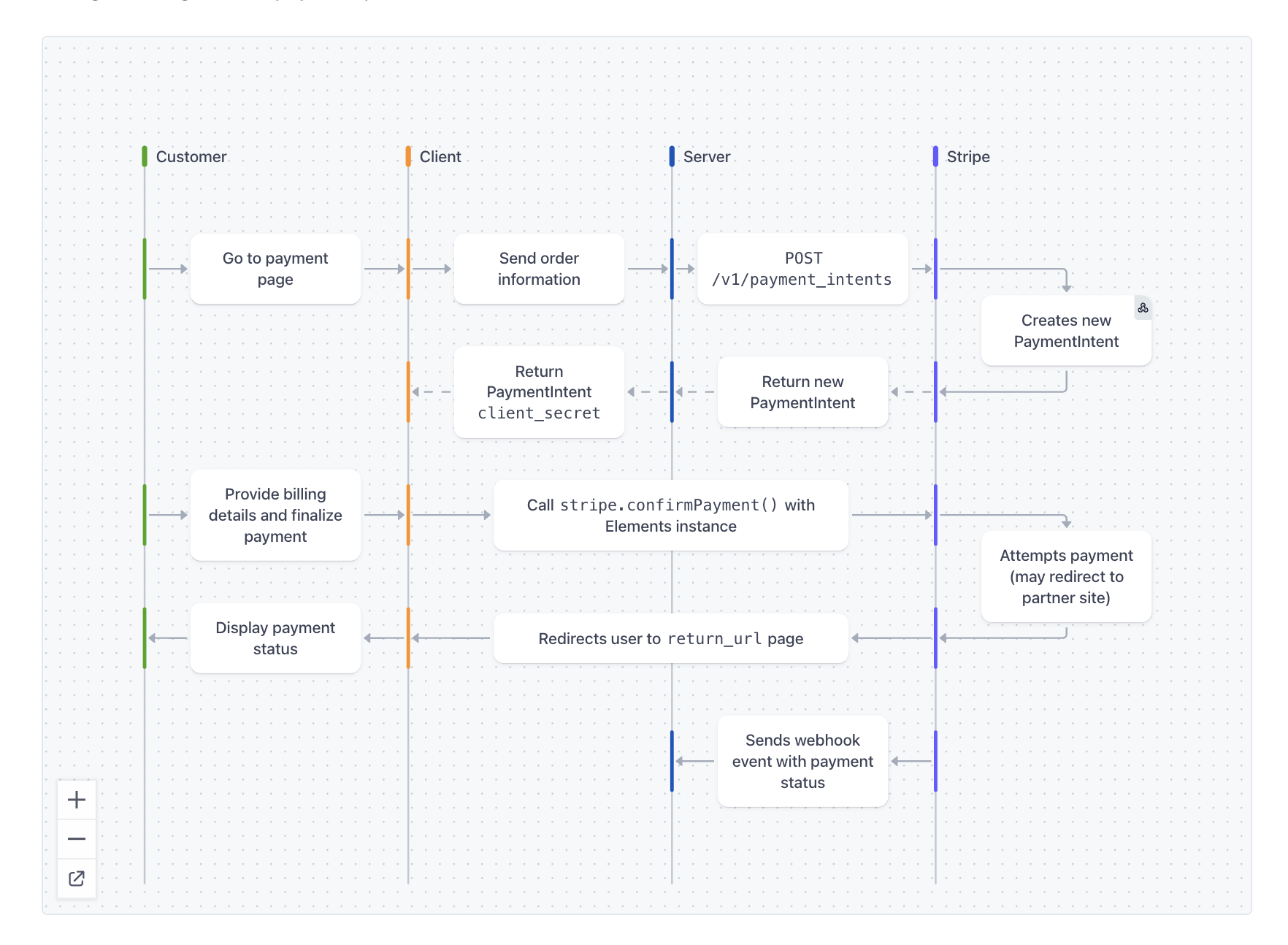
If you haven't seen one already:
- each column represents who is making each request (a computer or a person)
- each box is an action they can make
- each arrows is the request / responses between them.
- As they make requests, tiem
They are great. You can see the order of the requests, the dependencies between them, who does what, and more. Importantly, when you are coding and you see a code snippet by itself like this one:
const r = await stripe.confirmPayment();
you can find it its corresponding request and see the context in which it happens even if the code surrounding it doesn't have it.
Adrienne Dreyfus did much of the work to make and standardize these diagrams throughout the Stripe documentation.
Idea: Can you generate one of these diagrams directly from the end-to-end tests you wrote for your service?
That example doesn't show the passing of time while the messages are traveling. Note that the arrows run horizontal. But you can use the same diagram to diagnose race conditions or other bugs that depend on out-of-order or timing problems.
Aphyr often uses their own version of swimlane diagrams to show how different processes view state in a distributed system. For example, in the Jepsen VoltDB 6.3 analysis, they show how different database nodes can send messages to each other:
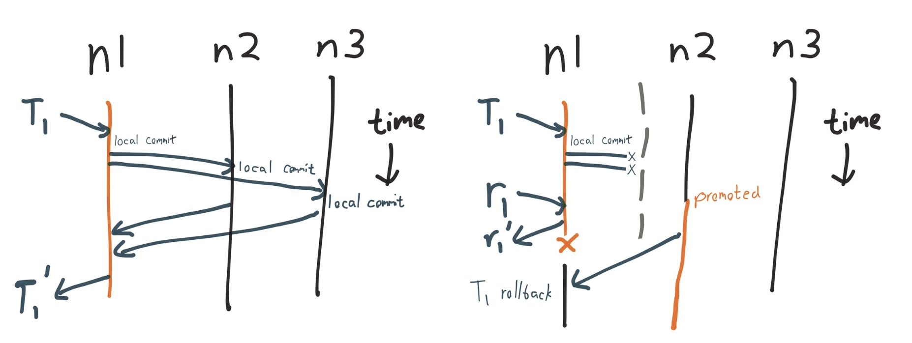
In this version of the swimlane the passage of time between requests is crucial to understand the problems with the system.
The same post also shows an interactive diagram that resembles a swimlane to visualize the results from the Jepsen tool:
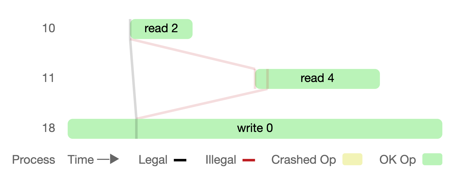
- Each "swimlane" is now horizontal, a numbered row (10, 11, 18) representing a process that is either reading or writing data.
- The blocks are the process' operations and they time they take to completeķ- The lines represent logical relationships between the data the processes see. The lines that break linearizability are marked Illegal and red.
Another very cool example is in the documentation for Signal's Double Rachet algorithm. These diagrams track what Alice and Bob need at each step of the protocol to encrypt and decrypt the next message:
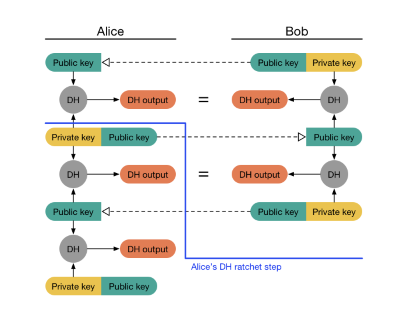
The protocol is complicated enough for me to think that the diagrams are the source of truth of the protocol. In other words, I'd venture to say that if an implementation of the Double Rachet algorithm ever does something that doesn't match the diagrams, it is more likely it is the code that is wrong than vice-versa. It is in these domains where I think visual programming should actually be the medium of programming but that is for a different post.
Footnotes
- I don't know if the code above is right – it is what I could deduce from the diagram.↩
- This is the standard critique of visual programming systems and IMO, the crowd is right to be dismissive. But why do people keep coming back to visual programming? What should they do instead?↩
- Rich also gave a neat presentation on Clojure's history, narrating why those burndown charts look the way they do: Clojure avoids rewrites beyond bug fixes to keep the code stable.↩